The upcoming Tyr release is set to bring exciting new functionality and enhancements to both Moodle LMS and Moodle Workplace customers who are utilising Moodle V4.2.
Building upon our strong foundation, we have listened to user feedback and focused on improving various areas of the platform. From new visual elements to improved accessibility and mobile access, these features are designed to enhance user experience and provide greater customisation options.
Supported on version(s):
A note from Edd Clementson, Product lead at Titus
The Tyr release builds upon an already solid foundation by adding new functionality into multiple areas of the platform.
We are introducing new options for displaying content onto the site home page through the introduction of a new feature banner and a new shortcut style, with supporting options. In order to maintain a more consistent user experience we have rebuilt the user menu that was previously a dropdown, into a right hand side drawer. This provides users quick access to key links; and new functionality allowing them to personalise their experience further by selecting a cover photo. We’ve made enhancements across multiple parts of the site, including enrolment page improvements, tweaks to the mobile display of a number of pages and introduced show password functionality to the login and self register pages.
We’ve ensured the priority of mobile access and general accessibility has been high, to deliver an improved experience on more devices and to even more users.
As always, we greatly encourage you to provide feedback and submit requests/votes via our portal page, for what you’d like to see next.
With thanks to the team who worked on this release:
Edd Clementson, Product Lead
Connor Young, Developer (Release Lead)
Vagelis Simitis, Developer
Kristian Burgess, UX Designer
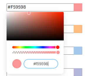
A newly introduced feature banner can replace the slideshow on the site home page. It allows for large amount of customisation including banner image, banner background colour; and a host of extra height and text based options.
New carousel controls have been introduced to assist with accessibility alongside some improvements to the overall styling. Additionally are new additions to the slideshow height dropdown, allowing you to have larger & more striking slideshows to the site home page.
A new shortcut style has been introduced to add another flavour to the site home page. Up to 9 of these can be added, with the ability to change the text, link and icon.
You are now able to determine whether non-logged in users (non authenticated users) can view shortcuts placed on the site home page. If guest visibility is disabled, users must be logged in before being able to view the contents.
Administrators on Moodle Workplace now have the option to import a theme file and select which tenants to import these settings into. This will speed up the personalisation & branding, especially on larger sites with many tenants.
To maintain a more consistent user experience we have re-implemented the user dropdown menu as a user drawer. This drawer allows users to select their own profile cover photo and displays the logged in users last accessed course. Furthermore it lists customisable links and key profile information such as timezone, country & email.
A new setting allows ‘Show password’ functionality to be displayed on the login page for the password field. Similarly, ‘show password’ functionality is also now present on the self register page. This feature will help users access the site more easily.
Bulk actions for course topics/sections and activities are now actionable from within a course when in edit mode. Activities can be selected in bulk and actioned by mass changing availability, duplicating, moving or deleting.
Styling improvements have been made to the course enrolment page. These include the re-positioning/resizing of the course image & description, inclusion of tags, custom fields, and course contacts.
Mailto links can now be added into the sitewide footer. This allows for users to select links to send emails, such as to technical support or key contacts.
Numerous accessibility enhancements have been made in this minor release of the theme; all with the aim to make the platform more accessibility to all users. These include:
Many more great features have made it into this release. These have been listed below.


Smaller improvements include: